안드로이드 ConstraintLayout은 여전히 실무에서 자주 만나는 레이아웃입니다. 그런데 실제로 많이 막히는 지점은 개념 자체보다 0dp, bias, chain, guideline, barrier, dimensionRatio 같은 속성이 정확히 언제 의미를 가지는지입니다.
이번 글에서는 Android 공식 문서 기준을 바탕으로 ConstraintLayout의 기본 원리와 자주 헷갈리는 속성을 실제 XML 예시와 함께 정리하겠습니다. 즉, 속성 이름을 외우는 글이 아니라 왜 그렇게 동작하는지 이해하는 글로 가져가겠습니다.
왜 ConstraintLayout이 아직도 중요한가
ConstraintLayout은 단순히 제약을 거는 레이아웃이 아니라, 여러 뷰의 관계를 기준으로 화면을 구성할 수 있게 해주는 도구에 가깝습니다. 이미지, 텍스트, 버튼이 서로를 기준으로 정렬되거나, 텍스트 길이에 따라 다른 뷰 위치가 함께 움직여야 하는 화면에서는 특히 강점을 보입니다.
즉, ConstraintLayout의 핵심은 부모에만 붙여서 배치하는 것이 아니라 뷰와 뷰 사이 관계를 명시적으로 표현하는 것입니다.
ConstraintLayout의 기본 원리
ConstraintLayout을 이해할 때 가장 먼저 잡아야 할 기준은 간단합니다. constraint는 연결입니다. 어떤 뷰의 start, end, top, bottom이 어디에 붙는지 정하고, width와 height는 별도로 크기를 결정합니다.
<Button
    android:id="@+id/button"
    android:layout_width="wrap_content"
    android:layout_height="wrap_content"
    android:text="확인"
    app:layout_constraintStart_toStartOf="parent"
app:layout_constraintTop_toTopOf="parent" />이 예시에서 버튼은 부모의 start와 top에 연결되어 위치를 잡습니다. 여기서 중요한 점은 start, end, top, bottom 같은 속성은 위치를 설명하고, wrap_content, 0dp, 고정 dp 값은 크기를 설명한다는 것입니다. 이 둘을 섞어서 생각하면 바로 헷갈리기 시작합니다.
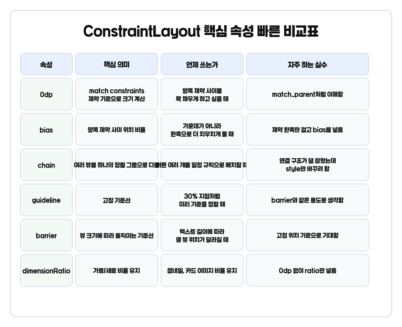
안드로이드 ConstraintLayout에서 가장 먼저 헷갈리는 설정값
0dp는 match_parent가 아니다
ConstraintLayout에서 0dp는 보통 match constraints를 뜻합니다. 즉, 부모를 무조건 꽉 채우라는 뜻이 아니라 걸려 있는 제약을 기준으로 크기를 계산하라는 의미에 가깝습니다. Android 공식 문서도 ConstraintLayout 안에서는 match_parent 대신 0dp를 기준으로 생각하라고 설명합니다.
<TextView
    android:id="@+id/title"
    android:layout_width="0dp"
    android:layout_height="wrap_content"
    android:text="ConstraintLayout 예시"
    app:layout_constraintStart_toStartOf="parent"
    app:layout_constraintEnd_toEndOf="parent"
app:layout_constraintTop_toTopOf="parent" />이때 width가 0dp라는 말은 부모 전체 너비를 무조건 차지한다는 뜻이 아닙니다. start와 end 제약 사이 공간을 기준으로 width를 계산하겠다는 뜻입니다. 즉, 0dp는 제약 기반 크기 계산으로 이해하는 편이 정확합니다.
언제 width를 0dp로 두고, 언제 height를 0dp로 둘까
- 가로 제약을 양쪽에 걸고 그 사이를 기준으로 넓어져야 한다 -> layout_width=0dp
- 세로 제약을 위아래에 걸고 그 사이를 기준으로 높아져야 한다 -> layout_height=0dp
실무에서는 제약으로 계산하고 싶은 축을 0dp로 둔다고 생각하면 훨씬 덜 헷갈립니다.
wrap_content와 match_parent
wrap_content는 내용이 필요한 만큼만 크기를 잡으려는 설정입니다. 반면 ConstraintLayout 안에서 match_parent는 제약 기반 계산 구조를 덜 활용하게 만들기 때문에, 공식 문서도 보수적으로 다루라고 설명합니다.
bias
bias는 가운데 정렬 옵션으로만 이해하면 자꾸 헷갈립니다. 정확히는 양쪽 제약 사이에서 어느 쪽에 더 가깝게 둘지 정하는 비율입니다.
<Button
    android:id="@+id/button"
    android:layout_width="wrap_content"
    android:layout_height="wrap_content"
    android:text="확인"
    app:layout_constraintStart_toStartOf="parent"
    app:layout_constraintEnd_toEndOf="parent"
    app:layout_constraintTop_toTopOf="parent"
app:layout_constraintHorizontal_bias="0.3" />기본값은 0.5이고, 이 경우 가운데에 옵니다. 0.3처럼 더 작은 값을 주면 start 쪽으로 더 가깝게 배치됩니다.
실무에서 bias가 안 먹는 것처럼 보이는 가장 흔한 이유는 양쪽 제약이 모두 걸려 있지 않기 때문입니다. bias를 넣기 전에 먼저 이 뷰가 양쪽 기준 사이에 놓여 있는가를 확인하는 습관이 중요합니다.
chain
Android 공식 가이드는 chain을 양방향 제약으로 연결된 뷰 그룹으로 설명합니다. 즉, 여러 뷰를 단순히 나란히 놓는 것이 아니라 하나의 정렬 규칙으로 다루는 방식입니다.
<Button
    android:id="@+id/btn1"
    android:layout_width="wrap_content"
    android:layout_height="wrap_content"
    android:text="A"
    app:layout_constraintStart_toStartOf="parent"
    app:layout_constraintEnd_toStartOf="@id/btn2"
    app:layout_constraintTop_toTopOf="parent" />

<Button
    android:id="@+id/btn2"
    android:layout_width="wrap_content"
    android:layout_height="wrap_content"
    android:text="B"
    app:layout_constraintStart_toEndOf="@id/btn1"
    app:layout_constraintEnd_toStartOf="@id/btn3"
    app:layout_constraintTop_toTopOf="parent" />

<Button
    android:id="@+id/btn3"
    android:layout_width="wrap_content"
    android:layout_height="wrap_content"
    android:text="C"
    app:layout_constraintStart_toEndOf="@id/btn2"
    app:layout_constraintEnd_toEndOf="parent"
app:layout_constraintTop_toTopOf="parent" />대표적인 chain style은 spread, spread_inside, packed입니다. 예를 들어 가운데에 버튼 그룹을 모아두고 싶다면 packed가 잘 맞습니다.
chain이 잘 안 잡히는 이유도 단순합니다. style 문제가 아니라 연결 구조가 먼저 완성되지 않았기 때문입니다. 첫 번째와 마지막 뷰가 부모와 연결되고, 중간 뷰들이 양방향으로 이어져 있어야 체인이 기대대로 동작합니다.
guideline과 barrier
이 둘은 같이 많이 나오지만 의미는 꽤 다릅니다. guideline은 미리 위치를 정해두는 고정 기준선이고, barrier는 참조한 뷰들의 위치에 따라 움직이는 동적 기준선입니다.
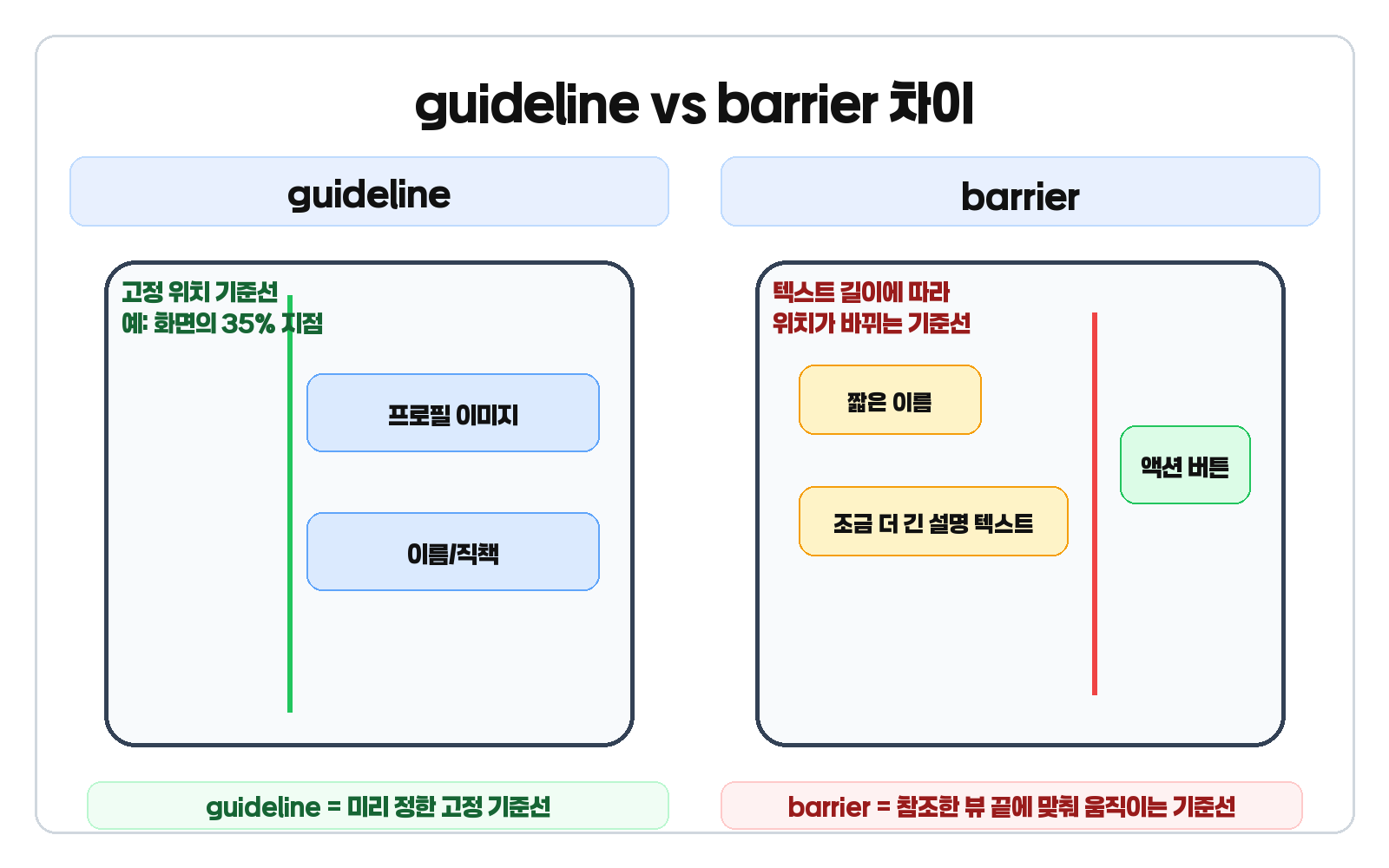
guideline
<androidx.constraintlayout.widget.Guideline
    android:id="@+id/guideline"
    android:layout_width="wrap_content"
    android:layout_height="wrap_content"
    android:orientation="vertical"
app:layout_constraintGuide_percent="0.3" />화면 너비의 30% 지점처럼 기준을 먼저 정해두고, 다른 뷰를 그 선에 맞춰 배치하고 싶을 때 guideline이 적합합니다.
barrier
<androidx.constraintlayout.widget.Barrier
    android:id="@+id/textBarrier"
    android:layout_width="wrap_content"
    android:layout_height="wrap_content"
    app:barrierDirection="end"
    app:constraint_referenced_ids="nameText,descriptionText" />

<Button
    android:id="@+id/actionButton"
    android:layout_width="wrap_content"
    android:layout_height="wrap_content"
    android:text="수정"
    app:layout_constraintStart_toEndOf="@id/textBarrier"
app:layout_constraintTop_toTopOf="parent" />텍스트 길이가 길어질 수도 짧아질 수도 있는 화면에서는 barrier가 더 자연스럽습니다. 이름과 설명 텍스트 중 더 긴 쪽 끝을 기준으로 버튼 위치를 잡고 싶을 때 특히 유용합니다.
dimensionRatio
dimensionRatio도 자주 헷갈리는 속성입니다. Android 공식 가이드는 ratio를 쓰려면 적어도 한 축이 0dp, 즉 match constraints여야 한다고 설명합니다.
<ImageView
    android:id="@+id/thumbnail"
    android:layout_width="0dp"
    android:layout_height="wrap_content"
    android:scaleType="centerCrop"
    app:layout_constraintStart_toStartOf="parent"
    app:layout_constraintEnd_toEndOf="parent"
    app:layout_constraintTop_toTopOf="parent"
app:layout_constraintDimensionRatio="16:9" />실전에서는 카드 썸네일처럼 가로 폭은 제약으로 맞추고, 세로 높이는 비율로 계산하고 싶을 때 자주 씁니다. 즉, ratio는 단독 마법 옵션이 아니라 match constraints와 함께 이해해야 하는 속성입니다.
ratio가 안 먹는 것처럼 보일 때 체크할 것
- width 또는 height 중 적어도 한 축이 0dp인가
- 그 축이 실제로 제약으로 연결되어 있는가
- ratio 문자열 형식이 올바른가
실무에서 자주 틀리는 포인트
- 0dp를 match_parent처럼 이해하는 실수
- bias를 가운데 정렬 옵션처럼만 보는 실수
- chain을 style 하나로만 생각하고 연결 구조를 놓치는 실수
- guideline과 barrier를 같은 용도로 보는 실수
- ratio가 아무 조건 없이 먹는다고 생각하는 실수
- 모든 화면을 ConstraintLayout 하나로만 해결하려는 실수
ConstraintLayout은 강력하지만, 단순히 수직으로만 쌓이는 화면까지 무조건 이 레이아웃 하나로 밀어붙이는 것이 정답은 아닙니다. 화면이 단순하면 LinearLayout이나 FrameLayout이 더 읽기 쉬울 수도 있습니다.
한 번에 정리
- 0dp는 match_parent가 아니라 match constraints로 이해한다
- bias는 양쪽 제약 사이에서 의미가 생긴다
- chain은 양방향 제약으로 연결된 그룹이다
- guideline은 고정 기준선, barrier는 동적 기준선이다
- dimensionRatio는 적어도 한 축이 0dp일 때 같이 이해해야 한다
즉, ConstraintLayout은 속성을 외우는 레이아웃이 아니라 제약 관계를 읽는 레이아웃이라고 이해하는 편이 훨씬 정확합니다.
마무리
안드로이드 ConstraintLayout은 처음에는 설정값이 많아 복잡해 보이지만, 0dp, bias, chain, guideline, barrier, ratio 여섯 가지를 정확히 잡으면 실무에서 막히는 시간이 크게 줄어듭니다. 특히 XML 유지보수를 자주 하는 프로젝트라면 이 기준이 오래 갑니다.
관련해서 안드로이드 UI와 구조를 더 넓게 보고 싶다면 안드로이드 색상 투명도 hex 정리, ViewModel은 왜 필요할까 글도 함께 읽어보면 좋습니다. 공식 기준은 Android Developers ConstraintLayout 가이드, ConstraintLayout API reference, ConstraintSet API reference를 참고하면 됩니다.


 – 안드로이드 앱은 어떻게 돌아갈까")
 – ViewModel은 왜 필요할까")

