ConstraintLayout Barrier는 텍스트 길이가 바뀌어도 View가 서로 겹치지 않게 만드는 동적 기준선입니다. Guideline이 화면의 고정 위치나 비율 위치를 기준으로 삼는다면, Barrier는 참조한 View들의 실제 위치를 기준으로 움직입니다.
이번 글에서는 ConstraintLayout Barrier를 “보이지 않는 선”이라는 말로만 끝내지 않겠습니다. 짧은 label, 긴 label, 여러 TextView, 버튼 배치, barrierDirection, constraint_referenced_ids, barrierAllowsGoneWidgets까지 실제 XML 예시와 이미지로 나눠 보겠습니다.
ConstraintLayout Barrier 핵심 정리
- Barrier는 여러 View의 edge를 보고 만들어지는 동적 기준선입니다.
- 참조 View는
app:constraint_referenced_ids로 지정합니다. - 기준 방향은
app:barrierDirection으로 정합니다. - 다른 View는 Barrier에 constraint를 걸 수 있습니다.
- Guideline은 스스로 위치를 정하고, Barrier는 참조 View 위치에 따라 움직입니다.
ConstraintLayout Barrier가 필요한 순간
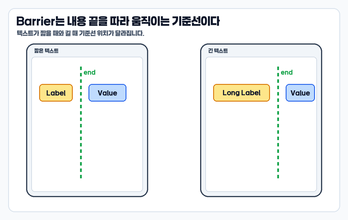
Barrier는 한 View의 위치가 아니라 여러 View 중 가장 멀리 나온 edge를 기준으로 다음 View를 배치하고 싶을 때 사용합니다. 대표적인 예가 label/value UI입니다. label 텍스트가 짧을 때는 문제가 없어 보이지만, 긴 텍스트나 다국어 문자열이 들어오면 value나 button이 label과 겹칠 수 있습니다.
공식 Android Developers 문서는 Barrier를 Guideline과 비슷한 보이지 않는 선으로 설명하되, Barrier는 자신의 위치를 직접 정의하지 않고 포함된 View 위치에 따라 움직인다고 설명합니다. 공식 기준은 Android Developers ConstraintLayout 가이드에서 확인했습니다.
Guideline으로 처리하면 왜 어색해질까
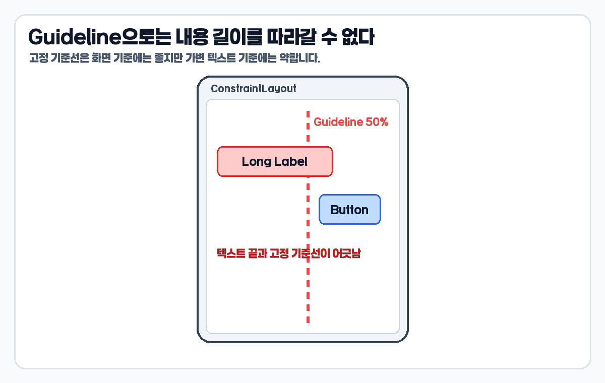
Guideline은 화면의 50% 지점, 시작 edge에서 24dp, 끝 edge에서 16dp처럼 먼저 위치가 정해지는 기준선입니다. 그래서 화면 분할이나 공통 여백에는 좋습니다. 하지만 텍스트가 길어질 때마다 기준선이 움직여야 하는 UI에는 맞지 않을 수 있습니다.
<androidx.constraintlayout.widget.Guideline
    android:id="@+id/valueGuideline"
    android:layout_width="wrap_content"
    android:layout_height="wrap_content"
    android:orientation="vertical"
    app:layout_constraintGuide_percent="0.5" />

<TextView
    android:id="@+id/labelText"
    android:layout_width="wrap_content"
    android:layout_height="wrap_content"
    android:text="Very long label text"
    app:layout_constraintStart_toStartOf="parent"
    app:layout_constraintTop_toTopOf="parent" />

<Button
    android:id="@+id/actionButton"
    android:layout_width="wrap_content"
    android:layout_height="wrap_content"
    android:text="Edit"
    app:layout_constraintStart_toEndOf="@id/valueGuideline"
app:layout_constraintTop_toTopOf="@id/labelText" />이 구조의 문제는 Guideline 자체가 잘못됐다는 뜻이 아닙니다. 기준선 선택이 문제입니다. 텍스트 끝을 따라 움직여야 하는데 화면 50%라는 고정 기준을 사용했기 때문에, 긴 텍스트에서는 버튼과 내용의 관계가 어색해집니다.
Barrier로 바꾸면 기준선이 내용 뒤로 이동한다
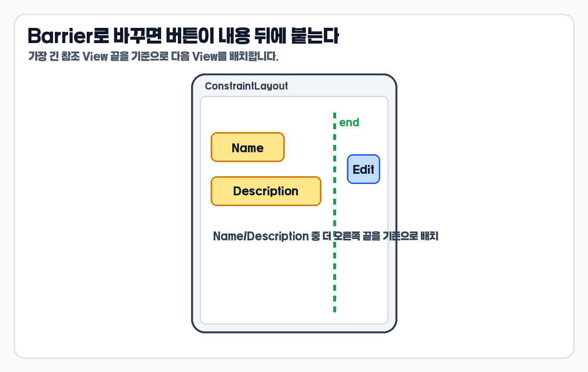
Barrier는 참조한 View의 지정 방향 edge를 봅니다. 예를 들어 barrierDirection="end"로 두면 참조 View들의 end edge 중 가장 멀리 나온 위치가 Barrier 기준선이 됩니다. 버튼은 그 Barrier 뒤에 붙이면 됩니다.
<TextView
    android:id="@+id/nameText"
    android:layout_width="wrap_content"
    android:layout_height="wrap_content"
    android:text="Name"
    app:layout_constraintStart_toStartOf="parent"
    app:layout_constraintTop_toTopOf="parent" />

<TextView
    android:id="@+id/descriptionText"
    android:layout_width="wrap_content"
    android:layout_height="wrap_content"
    android:text="Long description"
    app:layout_constraintStart_toStartOf="parent"
    app:layout_constraintTop_toBottomOf="@id/nameText" />

<androidx.constraintlayout.widget.Barrier
    android:id="@+id/textBarrier"
    android:layout_width="wrap_content"
    android:layout_height="wrap_content"
    app:barrierDirection="end"
    app:constraint_referenced_ids="nameText,descriptionText" />

<Button
    android:id="@+id/editButton"
    android:layout_width="wrap_content"
    android:layout_height="wrap_content"
    android:text="Edit"
    app:layout_constraintStart_toEndOf="@id/textBarrier"
app:layout_constraintTop_toTopOf="@id/nameText" />이제 editButton은 nameText와 descriptionText 중 더 오른쪽으로 긴 View 뒤에 배치됩니다. 텍스트가 짧으면 Barrier도 왼쪽에 있고, 텍스트가 길면 Barrier가 오른쪽으로 이동합니다.
여러 label 뒤에 value 시작선 맞추기
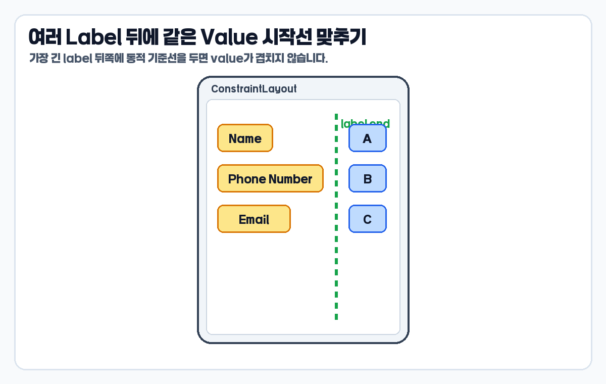
실무에서는 label 하나가 아니라 여러 label 뒤에 value를 정렬해야 하는 경우가 많습니다. 예를 들어 이름, 전화번호, 이메일 label의 길이가 서로 다르면 value 시작 위치가 제각각이 되거나, 긴 label과 value가 겹칠 수 있습니다.
<TextView
    android:id="@+id/nameLabel"
    android:layout_width="wrap_content"
    android:layout_height="wrap_content"
    android:text="Name" />

<TextView
    android:id="@+id/phoneLabel"
    android:layout_width="wrap_content"
    android:layout_height="wrap_content"
    android:text="Phone Number" />

<TextView
    android:id="@+id/emailLabel"
    android:layout_width="wrap_content"
    android:layout_height="wrap_content"
    android:text="Email" />

<androidx.constraintlayout.widget.Barrier
    android:id="@+id/labelEndBarrier"
    android:layout_width="wrap_content"
    android:layout_height="wrap_content"
    app:barrierDirection="end"
app:constraint_referenced_ids="nameLabel,phoneLabel,emailLabel" />이렇게 label들을 하나의 Barrier에 묶어두면 value View들은 labelEndBarrier의 end 쪽에 붙을 수 있습니다. 핵심은 “가장 긴 label이 무엇인지 미리 알 필요가 없다”는 점입니다.
barrierDirection은 무엇을 기준으로 볼지 정한다
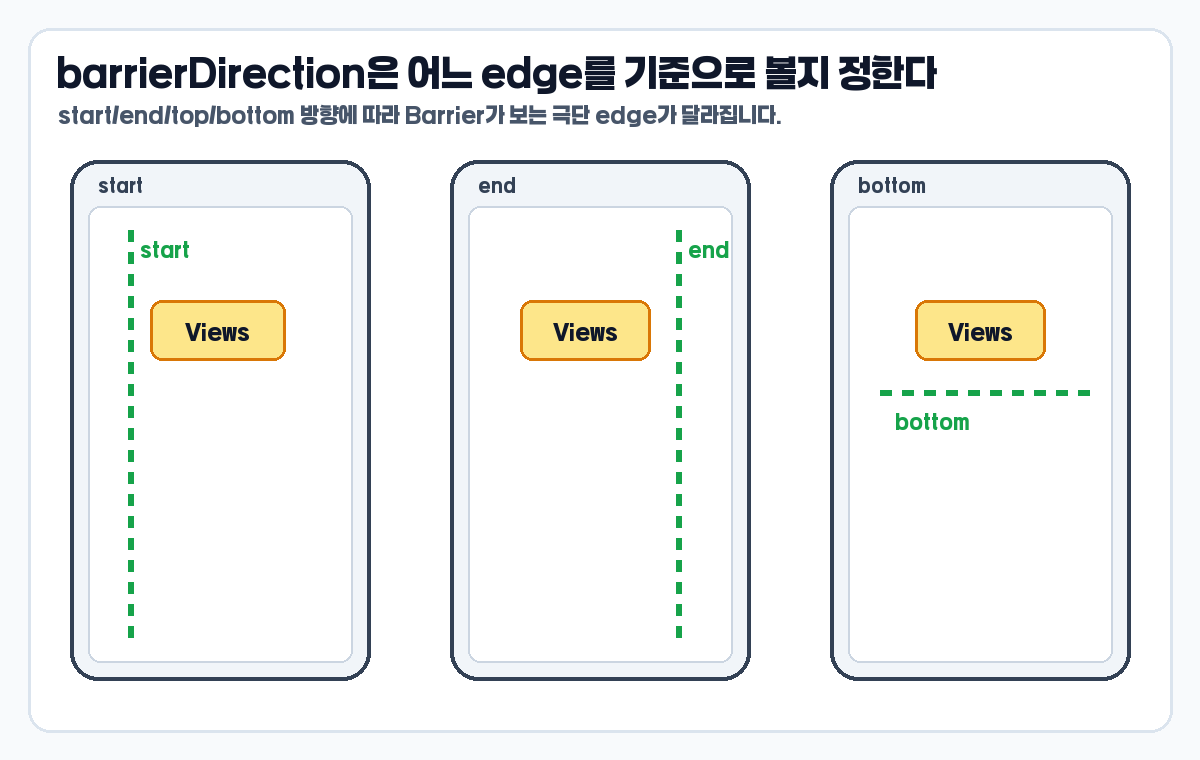
barrierDirection은 Barrier가 참조 View들의 어느 방향 edge를 볼지 정합니다. 왼쪽에서 오른쪽으로 읽는 화면이라면 label 뒤에 value를 붙일 때 보통 end를 많이 씁니다. 위아래 기준을 잡고 싶다면 top이나 bottom도 사용할 수 있습니다.
start: 참조 View들의 시작 edge 중 가장 바깥쪽 기준end: 참조 View들의 끝 edge 중 가장 바깥쪽 기준top: 참조 View들의 위쪽 edge 기준bottom: 참조 View들의 아래쪽 edge 기준
left/right보다 start/end를 먼저 고려하면 RTL 언어 환경까지 생각하기 쉽습니다. 단, 기존 프로젝트가 left/right 중심으로 되어 있다면 코드 스타일을 무리하게 섞지 않는 편이 좋습니다.
GONE View를 Barrier에 포함할지 확인하기
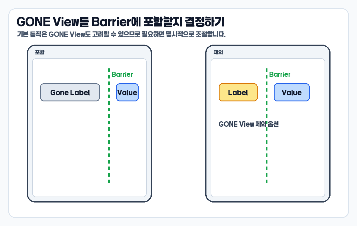
Barrier를 쓸 때 놓치기 쉬운 부분이 GONE View입니다. AndroidX Barrier 레퍼런스는 Barrier가 GONE widget을 참조할 때의 기본 동작과 barrierAllowsGoneWidgets 옵션을 설명합니다. 화면 상태에 따라 label이 사라지는 UI라면 이 옵션을 반드시 확인해야 합니다.
<androidx.constraintlayout.widget.Barrier
    android:id="@+id/labelEndBarrier"
    android:layout_width="wrap_content"
    android:layout_height="wrap_content"
    app:barrierDirection="end"
    app:barrierAllowsGoneWidgets="false"
app:constraint_referenced_ids="nameLabel,phoneLabel,emailLabel" />barrierAllowsGoneWidgets="false"로 두면 GONE 상태의 View를 Barrier 위치 계산에서 제외할 수 있습니다. 반대로 GONE View의 위치까지 기준에 포함해야 하는 설계라면 기본 동작을 그대로 둘 수 있습니다. 중요한 것은 상태별 UI에서 이 동작을 모르고 넘어가지 않는 것입니다.
Guideline과 Barrier를 어떻게 구분할까
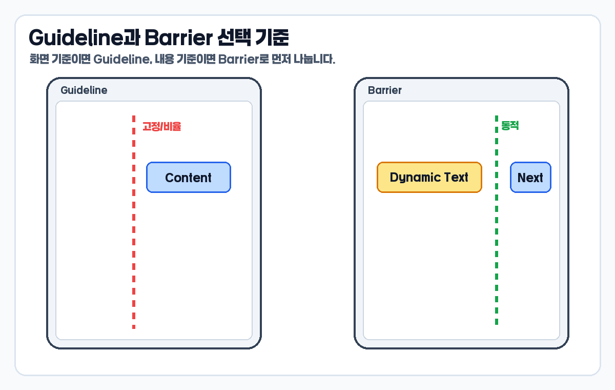
- 화면 기준이면 Guideline을 먼저 생각합니다.
- 내용 기준이면 Barrier를 먼저 생각합니다.
- 비율 분할, 공통 여백, 고정 시작선은 Guideline이 자연스럽습니다.
- 가변 텍스트, 다국어 문자열, 여러 label 중 가장 긴 항목 기준은 Barrier가 자연스럽습니다.
- Guideline과 Barrier는 우열 관계가 아니라 기준이 다른 도구입니다.
12편 Guideline을 이미 읽었다면 이 차이가 더 선명해집니다. Guideline은 설계자가 정한 기준선이고, Barrier는 실제 콘텐츠가 만든 기준선입니다.
이미지 사실성 검증
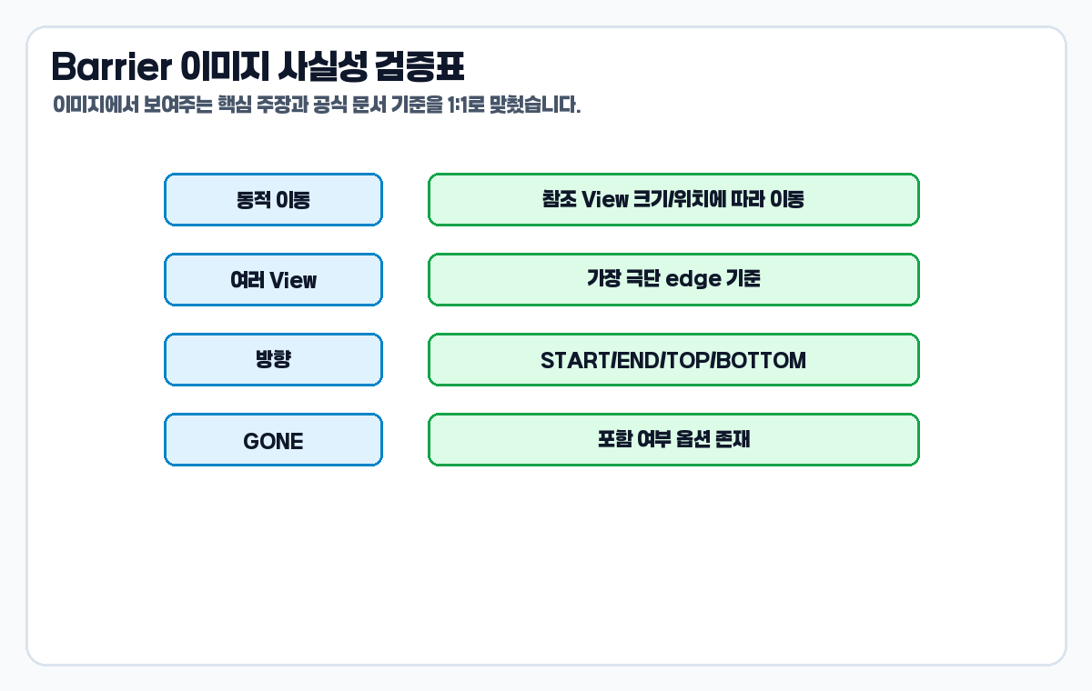
이번 글의 이미지는 실제 Android Studio Preview 캡처가 아니라 설명형 도식입니다. 그래서 이미지가 공식 동작보다 과장되거나 다른 의미로 보이지 않도록 각 이미지의 핵심 주장을 factpack과 대조했습니다.
- 짧은/긴 텍스트 이미지: Barrier가 참조 View 위치에 따라 이동한다는 공식 설명과 일치합니다.
- Guideline 실패 이미지: Guideline은 스스로 위치를 정한다는 설명 범위 안에서 표현했습니다.
- 가장 긴 View 기준 이미지: 지정 방향의 가장 극단 View를 기준으로 한다는 Barrier 레퍼런스와 일치합니다.
- barrierDirection 이미지: START, END, TOP, BOTTOM 방향 상수와 일치합니다.
- GONE 옵션 이미지:
barrierAllowsGoneWidgets설명과 일치합니다.
자주 하는 실수
- Barrier를 실제 화면에 보이는 선이라고 생각한다.
- 한 View만 기준이면 충분한데 불필요하게 Barrier를 만든다.
- 참조할 View id를
constraint_referenced_ids에 빠뜨린다. - label은 길어지는데 value 위치를 고정 Guideline에만 붙인다.
- GONE View가 Barrier 계산에 들어가는지 확인하지 않는다.
- start/end와 left/right를 프로젝트 안에서 무작위로 섞는다.
한 번에 정리
- ConstraintLayout Barrier는 동적 기준선이다.
- 참조 View 목록은
constraint_referenced_ids로 지정한다. - 기준 방향은
barrierDirection으로 정한다. - 텍스트 길이와 다국어 문자열 때문에 기준선이 움직여야 할 때 유용하다.
- Guideline은 화면 기준, Barrier는 내용 기준으로 구분하면 쉽다.
내용 길이가 기준선을 바꿔야 한다면 ConstraintLayout Barrier를 먼저 검토하세요. 화면 비율이나 고정 여백 기준이라면 Guideline이 더 단순합니다.
마무리
Barrier는 ConstraintLayout에서 가변 콘텐츠를 다룰 때 특히 빛을 발합니다. 텍스트 길이, 다국어 문자열, 여러 label 중 가장 긴 항목처럼 레이아웃 기준이 실행 시점에 달라질 수 있다면 Barrier가 XML을 더 안정적으로 만들어 줍니다.
공식 기준은 Android Developers ConstraintLayout 가이드와 AndroidX ConstraintLayout Barrier 레퍼런스를 확인했습니다. 다음 14편에서는 Group과 Placeholder를 통해 여러 View를 한 번에 숨기거나 위치를 바꾸는 방법을 이어서 보겠습니다.
Android ConstraintLayout 완전 정리 이전 글 모음
Android ConstraintLayout 완전 정리 (1) – ConstraintLayout 기본 사용법: LinearLayout과 다른 제약 기반 배치 이해하기
Android ConstraintLayout 완전 정리 (3) – ConstraintLayout goneMargin과 margin 차이: View.GONE일 때 간격이 바뀌는 이유
Android ConstraintLayout 완전 정리 (5) – ConstraintLayout match_constraint 완전 정리: 0dp가 남은 공간을 채우는 원리
Android ConstraintLayout 완전 정리 (7) – ConstraintLayout baseline 정렬: TextView 글자 기준선을 맞추는 방법
Android ConstraintLayout 완전 정리 (8) – ConstraintLayout dimensionRatio 사용법: 1:1, 16:9 이미지 비율 맞추기
Android ConstraintLayout 완전 정리 (9) – ConstraintLayout percent min max 크기 정리: 화면 크기에 맞게 View 조절하기
Android ConstraintLayout 완전 정리 (10) – ConstraintLayout chain 사용법: spread, spread_inside, packed 차이
Android ConstraintLayout 완전 정리 (11) – ConstraintLayout chain weight와 bias: 같은 폭, 다른 비율 배치 만들기
Android ConstraintLayout 완전 정리 (12) – ConstraintLayout Guideline 사용법: percent 기준선으로 화면 나누기


